こんにちは。
先日、頭痛と吐き気で1日寝込んでいたはこだてたろうです。
熱はなかったのですが、逆に平熱より1度低いという謎の症状でした。
毛布を何枚もかけても汗一つかかなかったです。
あれは一体なんだったのか。。。
はじめに
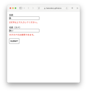
さて、前回の記事ではバリデーションつき入力欄コンポーネントを作成しました。
今回は入力欄の作りにならって、バリデーションつきセレクトボックスコンポーネントを作りたいと思います。
実物はこちら
リポジトリはこちら

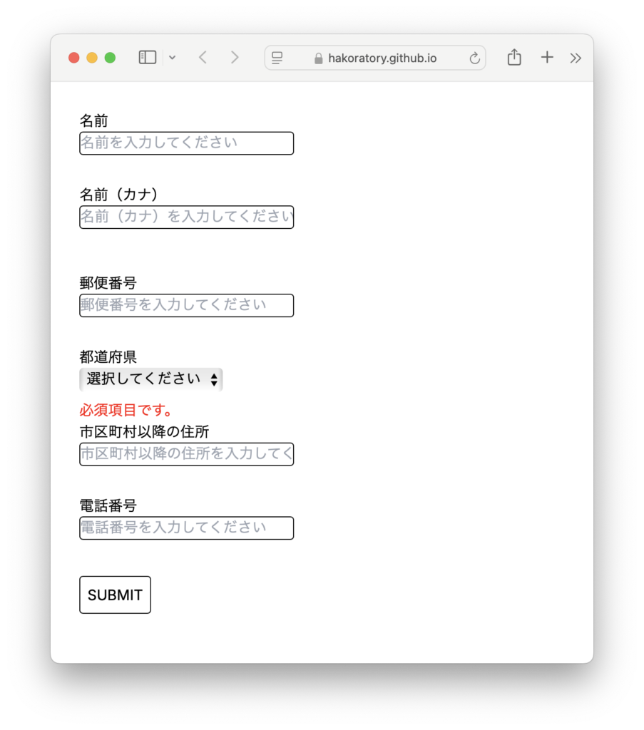
この記事を読むことで作れるもの
この記事を読むことで、以下のような画面が作れるようになります。
実装
先にコード全容です。
せっかくなので、前回作った バリデーションつき入力欄コンポーネント LabeledTextInputWithValidation も使っています。
'use client'

import React, { useState, ChangeEvent, FormEvent } from "react";
import './style.css'
import LabeledTextInputWithValidation from "@/app/input-field/select-box-component/components/LabeledTextInputWithValidation";
import {prefectures} from "@/data/prefectures";
import Label from "@/app/input-field/select-box-component/components/Label";
import ErrorMessage from "@/app/input-field/select-box-component/components/ErrorMessage";

type Option = {
  id: string;
  name: string;
}

type SelectBoxProps = {
  id?: string;
  value: string;
  options: Option[];
  onChange: (event: React.ChangeEvent<HTMLSelectElement>) => void;
}

function SelectBox({ id, value, options, onChange }: SelectBoxProps) {
  return (
    <select id={id} value={value} onChange={onChange}>
      <option value="">選択してください</option>
      {options.map((option) => (
        <option key={option.id} value={option.id}>{option.name}</option>
      ))}
    </select>
  );
}

type LabeledSelectBoxProps = SelectBoxProps & {
  label: string;
};

function LabeledSelectBox({ id, label, value, options, onChange }: LabeledSelectBoxProps) {
  return (
    <>
      <Label htmlFor={id} text={label}/>
      <div>
        <SelectBox
          id={id}
          value={value}
          options={options}
          onChange={onChange}
        />
      </div>
    </>
  )
}

function LabeledSelectBoxWithValidation(
  {
    id,
    label,
    value,
    options,
    onChange,
    required
  }: {
    id?: string;
    label: string;
    value: string;
    options: Option[];
    onChange: (event: ChangeEvent<HTMLSelectElement>) => void;
    required?: true;
  }
) {
  const [error, setError] = useState<string>('');

  const validate = (value: string): string => {
    if (required && value.trim() === '') {
      return `必須項目です。`;
    }
    return '';
  };

  const handleChange = (event: ChangeEvent<HTMLSelectElement>) => {
    const newValue = event.target.value;
    onChange(event);
    const errorMessage = validate(newValue);
    setError(errorMessage);
  };

  return (
    <>
      <LabeledSelectBox
        id={id}
        label={label}
        value={value}
        options={options}
        onChange={handleChange}
      />
      <div style={{color: 'red', fontSize: '1rem', minHeight: '1.5rem', marginTop: '0.5rem'}}>
        <ErrorMessage text={error}/>
      </div>
    </>
  )
}

function SelectBoxComponent() {
  const [name, setName] = useState<string>('');
  const [nameKana, setNameKana] = useState<string>('');
  const [postalCode, setPostalCode] = useState<string>('');
  const [prefecture, setPrefecture] = useState<string>('');
  const [address, setAddress] = useState<string>('');
  const [phoneNumber, setPhoneNumber] = useState<string>('');

  const handleSubmit = (event: FormEvent<HTMLFormElement>): void => {
    event.preventDefault();
    console.log({name, nameKana});
  };

  return (
    <main>
      <div style={{marginTop: '2rem', marginLeft: '2rem'}}>
        <form onSubmit={handleSubmit}>
          <div>
            <LabeledTextInputWithValidation
              label={'名前'}
              value={name}
              onChange={(event: ChangeEvent<HTMLInputElement>) => setName(event.target.value)}
              placeholder={'名前を入力してください'}
              required
              max={50}
              min={2}
            />
          </div>
          <div>
            <LabeledTextInputWithValidation
              label={'名前(カナ)'}
              value={nameKana}
              onChange={(event: ChangeEvent<HTMLInputElement>) => setNameKana(event.target.value)}
              placeholder={'名前(カナ)を入力してください'}
              required
              max={50}
              min={2}
              pattern={[
                {regex: /^[ァ-ヴ]+$/, message: 'カタカナのみ使用できます'}
              ]}
            />
          </div>
          <div style={{marginTop: '1rem'}}>
            <LabeledTextInputWithValidation
              label={'郵便番号'}
              value={postalCode}
              onChange={(event: ChangeEvent<HTMLInputElement>) => setPostalCode(event.target.value)}
              placeholder={'郵便番号を入力してください'}
              required
              max={7}
              min={7}
              pattern={[
                {regex: /^[0-9]+$/, message: '数字のみ使用できます'}
              ]}
            />
          </div>
          <div>
            <LabeledSelectBoxWithValidation
              value={prefecture}
              options={prefectures}
              onChange={e => setPrefecture(e.target.value)}
              label={'都道府県'}
              required
            />
          </div>
          <div>
            <LabeledTextInputWithValidation
              label={'市区町村以降の住所'}
              value={address}
              onChange={(event: ChangeEvent<HTMLInputElement>) => setAddress(event.target.value)}
              placeholder={'市区町村以降の住所を入力してください'}
              required
              max={50}
            />
          </div>
          <div>
            <LabeledTextInputWithValidation
              label={'電話番号'}
              value={phoneNumber}
              onChange={(event: ChangeEvent<HTMLInputElement>) => setPhoneNumber(event.target.value)}
              placeholder={'電話番号を入力してください'}
              required
              max={11}
              min={10}
              pattern={[
                {regex: /^[0-9]+$/, message: '数字のみ使用できます'}
              ]}
            />
          </div>
          <div style={{marginTop: '0.5rem'}}>
            <button type="submit">SUBMIT</button>
          </div>
        </form>
      </div>
    </main>
  );
}

export default SelectBoxComponent;
各部分の解説
セレクトボックスコンポーネントを作る
まずはセレクトボックスのコンポーネントを作ります。
SelectBox コンポーネントは select 要素のみを返します。div などでくくったりせず、レイアウトに関しては何も指定していないことに注目してください。
type Option = {
  id: string;
  name: string;
}

type SelectBoxProps = {
  id?: string;
  value: string;
  options: Option[];
  onChange: (event: React.ChangeEvent<HTMLSelectElement>) => void;
}

function SelectBox({ id, value, options, onChange }: SelectBoxProps) {
  return (
    <select id={id} value={value} onChange={onChange}>
      <option value="">選択してください</option>
      {options.map((option) => (
        <option key={option.id} value={option.id}>{option.name}</option>
      ))}
    </select>
  );
}
SelectBoxProps.id このプロパティは select 要素に id を指定するためのものです。
ラベルをクリックしたらセレクトボックスにフォーカスがあたるようにするために使用します。
SelectBoxProps.options このプロパティはセレクトボックスの選択肢を指定するためのものです。option 要素を表示するために、id と name を持つオブジェクトを渡す必要がありますが、それは TypeScript の型で制限しています。
ラベルつきのセレクトボックスコンポーネントを作る
次に、ラベルつきのセレクトボックスコンポーネントを作ります。
type LabeledSelectBoxProps = SelectBoxProps & {
  label: string;
};

function LabeledSelectBox({ id, label, value, options, onChange }: LabeledSelectBoxProps) {
  return (
    <>
      <Label htmlFor={id} text={label}/>
      <div>
        <SelectBox
          id={id}
          value={value}
          options={options}
          onChange={onChange}
        />
      </div>
    </>
  )
}
props は SelectBox コンポーネントとほぼ同じです。
ラベルを表示するために、label を追加しています。
Label コンポーネントは、前回の記事で作成したものです。
ラベルとセレクトボックスを横並びにしたくないので、SelectBox コンポーネントをdiv でくくっています。
このコンポーネントはラベルとセレクトボックスを束ねて表示するだけ、つまりレイアウトのみに集中していることに注目してください。
バリデーションつきのセレクトボックスコンポーネントを作る。
最後に、バリデーションつきのセレクトボックスコンポーネントを作ります。
function LabeledSelectBoxWithValidation(
  {
    id,
    label,
    value,
    options,
    onChange,
    required
  }: {
    id?: string;
    label: string;
    value: string;
    options: Option[];
    onChange: (event: ChangeEvent<HTMLSelectElement>) => void;
    required?: true;
  }
) {
  const [error, setError] = useState<string>('');

  const validate = (value: string): string => {
    if (required && value.trim() === '') {
      return `必須項目です。`;
    }
    return '';
  };

  const handleChange = (event: ChangeEvent<HTMLSelectElement>) => {
    const newValue = event.target.value;
    onChange(event);
    const errorMessage = validate(newValue);
    setError(errorMessage);
  };

  return (
    <>
      <LabeledSelectBox
        id={id}
        label={label}
        value={value}
        options={options}
        onChange={handleChange}
      />
      <div style={{color: 'red', fontSize: '1rem', minHeight: '1.5rem', marginTop: '0.5rem'}}>
        <ErrorMessage text={error}/>
      </div>
    </>
  )
}
props.required に true が指定されると必須チェックが行われ、未選択だった場合にエラーメッセージを表示します。
おわりに
いかがだったでしょうか?
今回は、入力欄コンポーネントの作りにならってセレクトボックスコンポーネントを作成しました。
ついでに郵便番号や住所の入力欄もいくつか追加してみましたが、いまのところ問題なく使えそうですね。
ハコラトリでは、「できる」を増やしてワクワクする人生を送るための情報をシェアしています。
ぜひ一緒にワクワクな人生を送れるように「できる」を増やしていきましょう。
これからもReactで色々なUIを作って紹介していきますので、「こんなUIを作ってみてほしい」「こんな場合はどうすれば?」といったアイディアを募集中です!
コメントお待ちしております。


コメント